If you’ve ever stared at a daily AI visibility chart and wondered whether that Tuesday dip actually means something or is just noise, you’re not alone. Daily data is essential for spotting immediate changes, but it can make it surprisingly hard to answer a simple question: is my brand’s AI visibility actually improving?
Writesonic’s GEO platform now includes Weekly and Monthly Aggregated Views across every trend chart and graph. This gives you the ability to toggle any time-series visualization from daily granularity to weekly or monthly summaries, so you can focus on the patterns that actually matter.
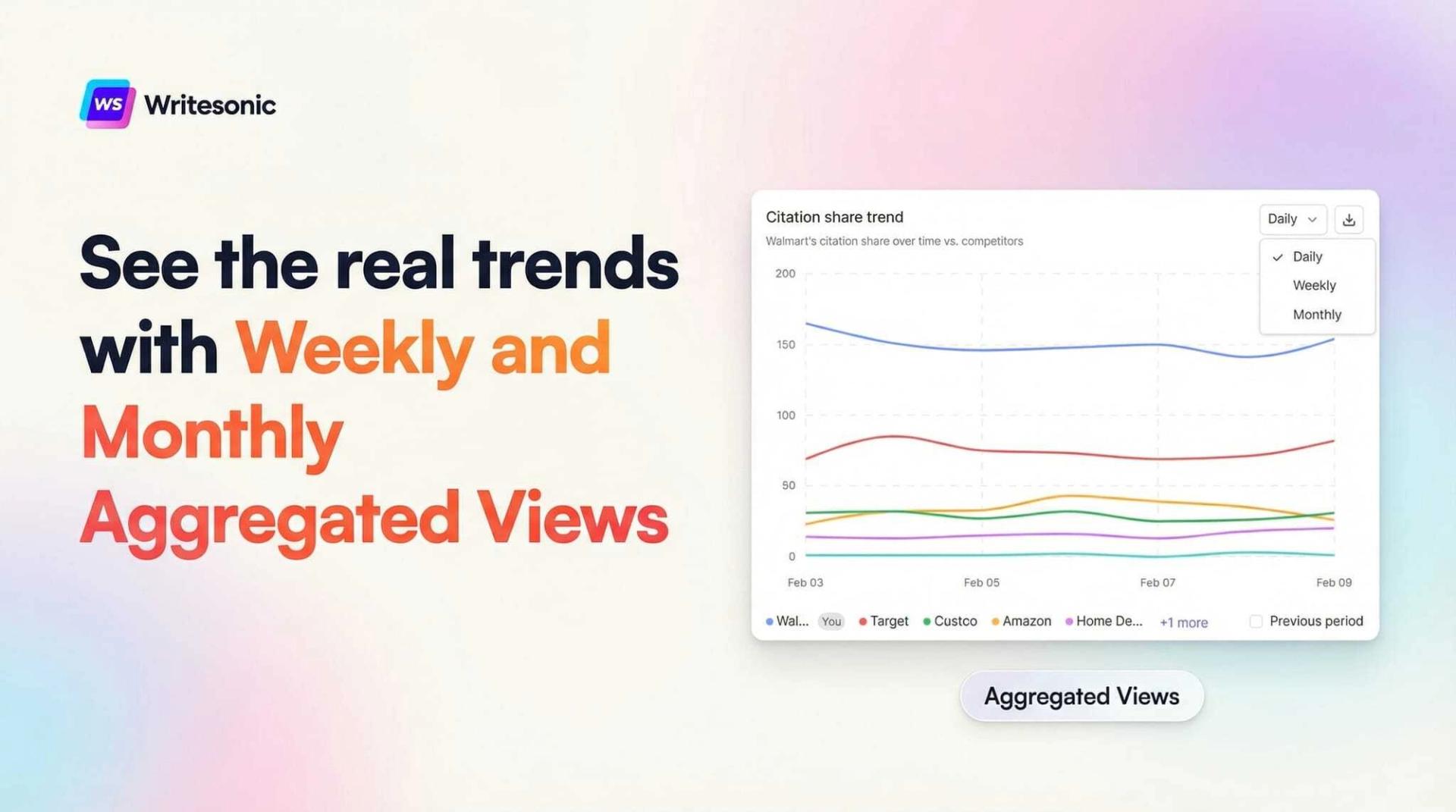
Why Daily Charts Aren’t Always Enough
AI search platforms like ChatGPT, Perplexity, and Google AI Overviews don’t behave like traditional search engines. Their responses shift based on model updates, prompt phrasing, crawl timing, and retrieval logic. On any given day, your brand’s visibility score might jump a few points up or down for reasons that have nothing to do with your content strategy.
This makes daily charts noisy by nature. And noisy charts lead to reactive decision-making. Teams end up chasing fluctuations instead of evaluating whether their GEO strategy is producing sustained results over time.
The Weekly and Monthly Aggregated View solves this by consolidating daily data points into seven-day or calendar-month summaries. Instead of plotting individual days, the chart shows a single aggregated value per interval, smoothing out the variance and making real trends visible at a glance.
How It Works
Every trend chart on the platform now includes a time-interval selector, typically a dropdown near the top-right corner. You’ll see three options: Daily, Weekly, and Monthly.
When you switch to Weekly, the chart groups your data into seven-day periods and displays a single aggregated value for each week. Monthly does the same by calendar month. The aggregation applies to every metric on the chart — AI Visibility, Citation Share, Share of Voice, Sentiment, and all competitor-level trend data.
A quick example: if your daily AI Visibility scores for a given week were 30%, 32%, 31%, 33%, 34%, 31%, and 32%, the weekly view would display a single data point representing the average for that entire period. The day-to-day noise disappears, and you can see whether visibility is trending upward, downward, or holding steady.
The interval selection is also chart-specific. Changing one chart to weekly won’t affect other charts on the same page, so you can mix and match intervals depending on what you’re analyzing.
Where You Can Use It
The aggregated view is available everywhere you see a trend chart on the platform. Here’s where it’s most useful:
Overview Dashboard. The Visibility Trend chart tracks your brand’s AI Visibility score over time alongside your competitors. Switching to the weekly view here gives you a clean week-by-week picture of how your brand stacks up — without the distraction of daily variance making it hard to tell who’s actually gaining ground.
Platforms View. This section breaks down visibility and citation share by individual AI platform — ChatGPT, Perplexity, Google AI Overviews, and others. The weekly interval is particularly valuable here because different platforms update at different cadences, and daily charts can exaggerate platform-specific quirks that aren’t meaningful long-term.
Competitors View. Head-to-head trend comparisons benefit the most from smoothed data. If a competitor has an unusually strong Tuesday but you’re tracking a 90-day window, one good day shouldn’t dominate the narrative. The weekly view ensures your competitive analysis reflects sustained performance differences.
Sentiment Page. Sentiment tracking monitors how AI platforms describe your brand — positive, negative, and neutral mentions over time. Daily sentiment can swing based on a single prompt sample. The weekly view smooths those swings and shows whether overall perception is genuinely shifting.
Citations & Prompts Page. Citation frequency is one of the clearest indicators of GEO performance. The weekly aggregated view makes it easier to evaluate whether your content optimization work is producing a sustained increase in citations or whether you’re seeing a temporary bump that fades after a few days.
When to Use Each View
Each interval serves a different purpose, and the best choice depends on what you’re trying to learn from the data.
Daily works best for short-term monitoring — checking the impact of a specific content publish, watching how a new competitor entry affects your metrics in real time, or diagnosing a sudden change. If your date range is under two weeks, daily will give you the most meaningful detail.
Weekly is the sweet spot for most operational use cases. It reveals week-over-week momentum, filters out daily noise, and is granular enough to catch emerging trends early. If you’re running a GEO optimization campaign and want to see whether your efforts are compounding, the weekly view will tell you clearly.
Monthly is designed for long-range analysis and reporting. Board updates, quarterly business reviews, investor decks — any context where your audience needs to see the big picture without getting lost in operational detail. Monthly views also help enterprise teams maintain a shared frame of reference across departments.
Practical Use Cases
Measuring campaign impact. You’ve published a batch of optimized content targeting key AI search queries. Daily charts might show an initial spike, but the weekly view tells you whether that lift is holding. If your weekly averages keep climbing for three or four weeks after the publish, you know the strategy is working. If they flatten after one week, you know to dig deeper.
Competitive benchmarking. Comparing brands on a daily basis can be misleading. One good crawl cycle or one viral mention can give a competitor a temporary score boost that disappears by Thursday. The weekly view reveals who’s actually gaining sustained ground, which is far more useful for strategic planning.
Executive reporting. Leadership teams want to see direction, not data points. A weekly or monthly chart communicates momentum clearly. You can pull a screenshot directly from the dashboard and drop it into a slide deck without having to explain why Tuesday was an outlier.
Cross-team alignment. When content, SEO, and product marketing teams are all looking at the same weekly trend data, conversations become more productive. Everyone’s working from the same baseline, and disagreements about whether things are “up” or “down” get resolved by the chart instead of by opinion.
Getting Started
The feature is live now across all accounts. To try it out:
- Navigate to any dashboard or report page with a trend chart — Overview, Sentiment, Citations, Prompts, Platforms, or Competitors.
- Find the time-interval dropdown near the top-right corner of the chart (set to Daily by default).
- Select Weekly or Monthly.
- Hover over any data point to see the aggregated tooltip with metric values for that interval.
The weekly view is especially valuable when you’re analyzing trends over a date range of two weeks or more. For shorter windows, daily will still give you the most useful level of detail.
This is one of those features that changes how you interact with the platform on a daily basis. Once you start using it for competitive analysis and reporting, the daily view starts to feel like looking at stock prices by the minute — technically accurate, but not where the real insight lives.
Niyati Mahale is a SEO/GEO Content Writer @Writesonic. She specializes in artificial intelligence and B2B, with a flair for combining effective storytelling and SEO best practices to create impactful content.